
Concepts - Bitcoin, Risk Analysis, Portfolio Optimization
In this work I analyze Bitcoin as an asset compared to other more traditional assets such as stocks and gold. Recently there has been large interest in Bitcoin as an investable asset due to it’s high returns in the last decade. I will attempt to give a full picture of the asset using the tools and techniques from traditional finance, then draw some insights and recommendations about whether or not to include it in the portfolio of any investment fund.
This work is intially published in DataCamp workspace
Github repo for this project
Table of Contents
- Introduction
- Exploratory Data Analysis
- CPI and Inflation
- Volatility analysis
- Correlation Analysis
- Porfolio Optimization
- Conclusion and recommendation
- References
Introduction
- Bitcoin https://bitcoin.org/en/bitcoin-paper
- S&P500 https://en.wikipedia.org/wiki/S%26P_500
- Gold https://www.investopedia.com/articles/economics/09/why-gold-matters.asp
In this work I analyze Bitcoin as an asset compared to other more traditional assets such as stocks and gold. Recently there has been large interest in Bitcoin as an investable asset due to it’s high returns in the last decade. I will attempt to give a full picture of the asset using the tools and techniques from traditional finance, then draw some insights and recommendations about whether or not to include it in the portfolio of any investment fund.
Exploratory Data Analysis
I will be using historical price data spanning from year September 2014 to November 2021. Each of the data sets for Bitcoin, SP500, Gold, and CPI do not match perfectly in their date columns because of differences in their trading frequency. Bitcoin uniquely trades 365 days of the year, whereas SP500 trades only 252 days of the year. Gold and CPI are given in a monthly data format.
In this report, I will be using my own shorthand notation, which you will see occasionally through out the notebook.
- BTC = Bitcoin
- SPX = S&P 500 index
- dr = daily returns
- mr = monthly returns
- ar = annual returns
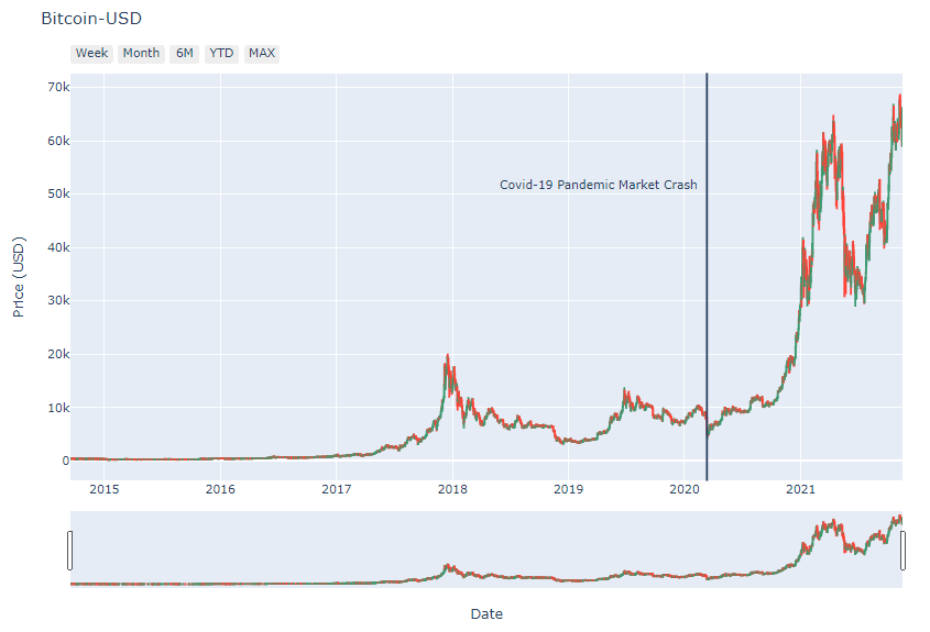 Historical Bitcoin prices.
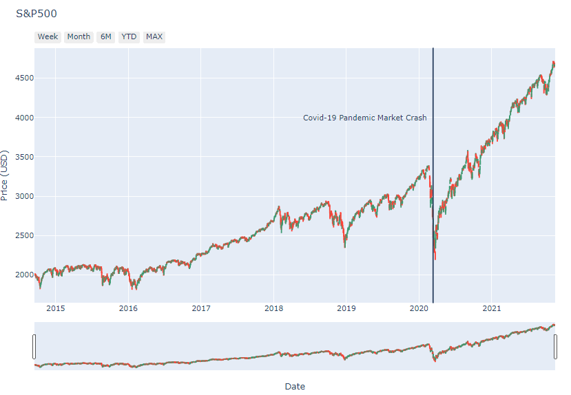 Historical SP500 price.
Historical Gold price.
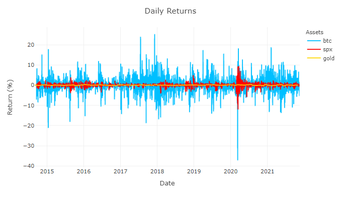 Daily returns time-series plot.
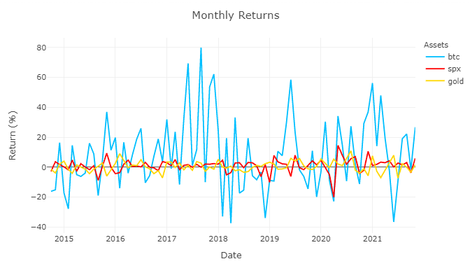 Monthly returns time-series plot.
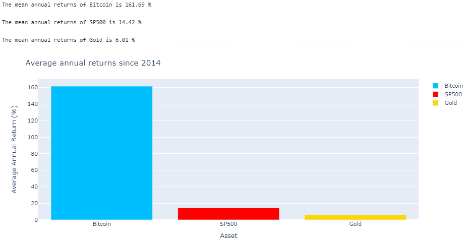 Comparison of average annual returns.
CPI and Inflation
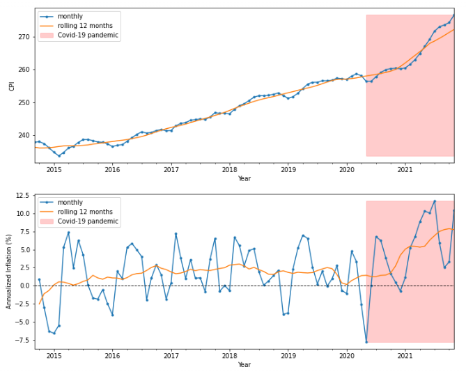
Consumer Price Index (CPI) is a measure of the general cost of living. It is calculated by the weighted average of the prices of certain consumer goods and services. Inflation rate is determined by the rate of change in CPI, which is considered to be the measure of the increase price of goods. More broadly, most investable assets appreciate in price due to inflation, therefore the inflation rate is considered a benchmark for all investment portfolios to surpass.
Looking closely at the tail of the CPI and inflation data, one should notice that there has been a inflection point near the start of the Covid-19 pandemic, where CPI rate change increases.
Volatility analysis
Drawdown Analysis
Drawdown is a measure of the percentage decline of the price from it’s recent peak. It is graphically shown in the plots below as the difference between the cumulative maximum (red line) and the daily price (blue line). Drawdowns analysis is used to show the potential downsides of an investment.
From the plots below, we can see the extreme differences between each asset. Gold is currently in it’s largest drawdown, spanning from August 2020 and still have not recovered. S&P500 had it’s largest drawdown recently during the start of the pandemic market crash in March 2020, dropping to about -30%. Though it promptly recovered by August 2020 spanning about 5 months. Bitcoin’s largest drawdown is a drop fo -83% and took about 3 years to recover. It is quite astounding to see that since 2014, Bitcoin has already multiple drawdown’s that are bigger and longer period than S&P500’s largest drawdown.
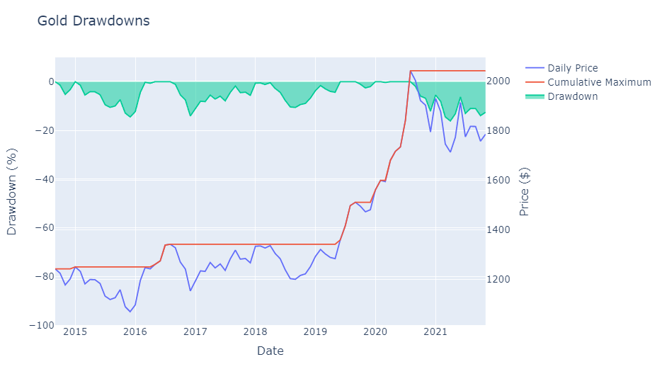 Gold drawdowns.
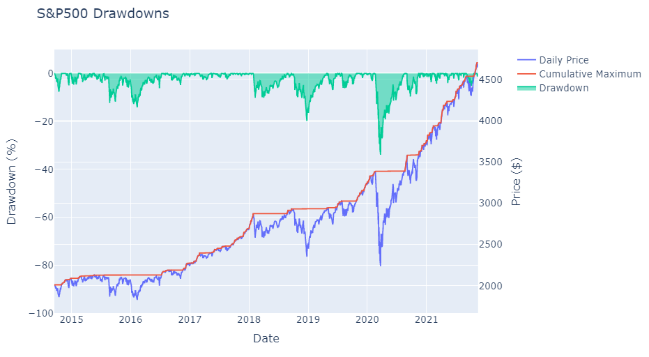 S&P500 drawdowns.
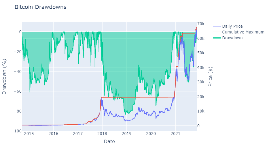 Bitcoin drawdowns.
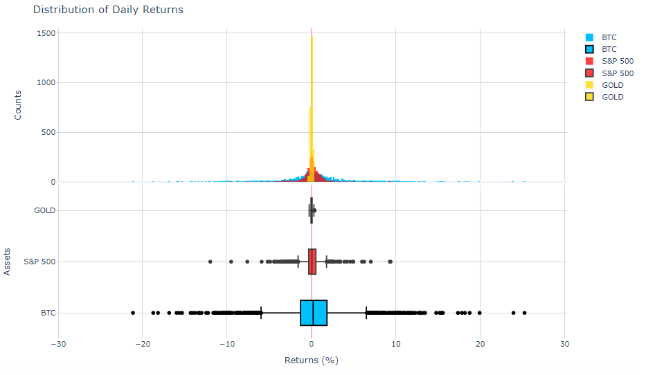
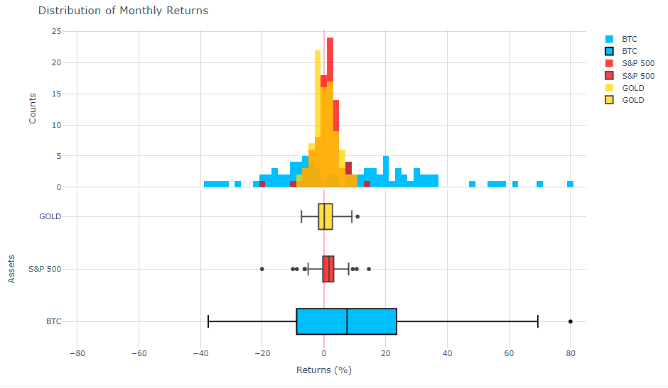
Distribution of Daily and Monthly Returns
Correlation Analysis
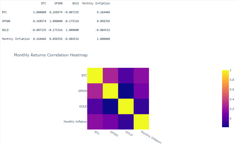
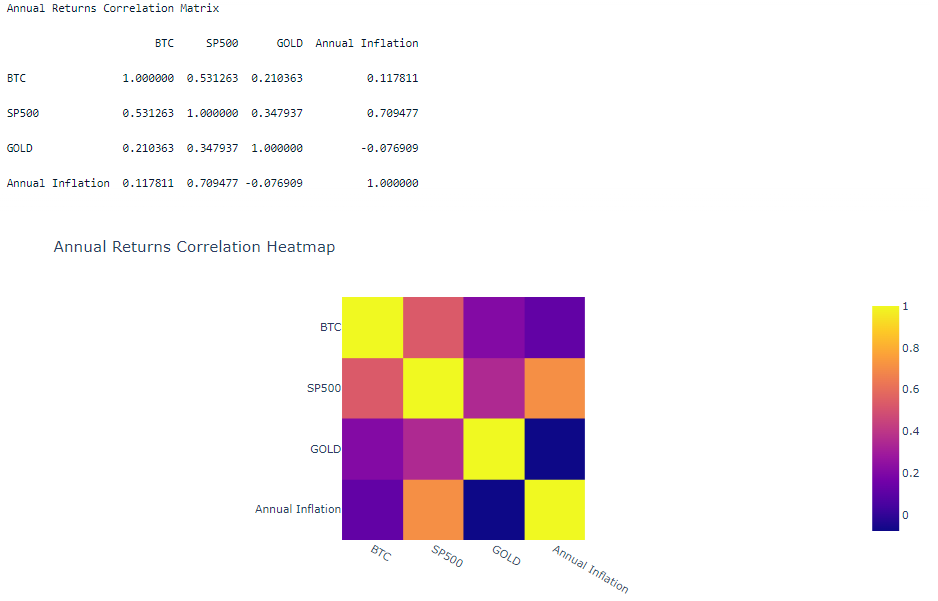
From this analysis, we can conclude that the 3 assets have very little correlation on a daily basis, however on a monthly and annual basis they show some correlation. Gold shows the least correlation with the other assets regardless of the sampling frequency.
I added the inflation rate for the monthly and annual correlation analysis to see which can be a potential hedge against inflation. Ideally we want an asset that is more correlated with the inflation rate to protect against the loss of purchasing power of the US dollar. On an annual basis, it seems the SP500 is the best asset for tracking inflation. I found that SP500 and Bitcoin returns show 26% correlation with each other on a monthly basis and 50% correlation on an annual basis. This positive low correlation can be just a result of both assets performing well in a long term basis and is indicative of a general bull market trend in the past few years.
Porfolio Optimization
In this section, I create a portfolio consisting of the 3 assets BTC, SPX, GOLD. I use traditional investing metrics to maximize the sharpe ratio and find the efficient frontier. Much of this work is adapted from this helpful blog link: https://towardsdatascience.com/efficient-frontier-in-python-detailed-tutorial-84a304f03e79
Calculating Sharpe ratio
The Sharpe ratio is a metric that represents the risk adjusted returns of a portfolio. Investment funds typically look for portfolios with reasonably high Sharpe ratios to mitigate it’s risk while trying to maximize returns.
Sharpe Ratio = (R_p - R_f)/{\sigma_p} R_p = return of portfolio R_f = risk free return \sigma_p = volatility i.e. standard deviation of the portfolio's return *\*sorry, I haven't figured out how to insert latex*
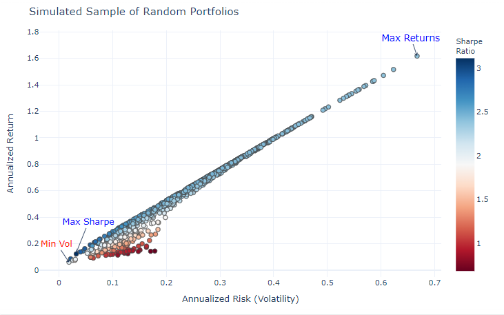
Visualizing the Efficient Frontier
Here I plot each simulated portfolio with returns on the y-axis and volatility on the x-axis. The Efficient Frontier is a set of optimal portfolios that yield the best risk-adjusted returns. In the plot below, the efficient frontier can be seen as a line of points on the top left edge of the cluster, drawing a line from the point of maximum return to the point of maximum Sharpe ratio.
Conclusion and recommendation
The results of section 6.3, not surprisingly, show that the portfolio with the highest returns consists of 100% Bitcoin (most top right point), yet also the most volatiliy. The point with the maximum Sharpe ratio is weighted 3.7% Bitcoin, 4.9% SP500, and 91.3% Gold. In traditional finance, the recommended Sharpe Ratio is 1 or above. Bitcoin’s high historical returns skews it’s Sharpe ratio favorably despite it’s high volatility.
This work suggest that Bitcoin is worth having in a portfolio for an optimized risk-adjusted return. It’s extreme volatility and potential downsides make it difficult for investment funds to allocate a large position on Bitcoin, so I recomment a small position just to capture it’s potential returns while mitigating it volatility. There are other reasons to put Bitcoin in a portfolio, such as it’s potential hedge against inflation and it’s decoupling from other traditional assets. One important caveat is that Bitcoin is a relatively new asset in the investing landscape, and it’s price history thus far may not be a good forecast of it’s future price movement.
References
Investment references
https://bitcoin.org/en/bitcoin-paper
https://www.investopedia.com/terms/b/bitcoin.asp
https://en.wikipedia.org/wiki/S%26P_500
https://www.investopedia.com/terms/s/sp500.asp
https://www.investopedia.com/articles/economics/09/why-gold-matters.asp
https://www.investopedia.com/terms/d/drawdown.asp
https://www.investopedia.com/terms/c/consumerpriceindex.asp
https://www.investopedia.com/terms/i/inflation.asp
https://www.investopedia.com/terms/e/efficientfrontier.asp
https://www.investopedia.com/terms/s/sharperatio.asp
https://towardsdatascience.com/efficient-frontier-in-python-detailed-tutorial-84a304f03e79